The Amplification Project
The Amplification Project
Improved the existing design system and restructured the site's information architecture.
Improved the existing design system and restructured the site's information architecture.
Overview
Overview
Overview
The Amplification Project is a community-led public participatory digital archive that documents, preserves, and shares art and activism inspired, influenced, or affected by conflict and displacement.
The Amplification Project is a community-led public participatory digital archive that documents, preserves, and shares art and activism inspired, influenced, or affected by conflict and displacement.
The Amplification Project is a community-led public participatory digital archive that documents, preserves, and shares art and activism inspired, influenced, or affected by conflict and displacement.
Timeline
Timeline
Timeline
Mar 2021 — June 2021
Mar 2021 — June 2021
Mar 2021 — June 2021
Context
Context
Context
UX Research and Design for UCLA Digital Humanities
UX Research and Design for UCLA Digital Humanities
UX Research and Design for UCLA Digital Humanities
My Role
My Role
My Role
Product Management
User Research
UX Design
Visual Design
Product Analysis
Product Management
User Research
UX Design
Visual Design
Product Analysis
Product Management
User Research
UX Design
Visual Design
Product Analysis
Team
Team
Team
1 Lead Designer (me)
2 Product Designers
1 Lead Designer (me)
2 Product Designers
1 Lead Designer (me)
2 Product Designers
Specific Contributions
Specific Contributions
I led the UX/UI design and product development of the Amplification Project's digital art archive. I collaborated with a team of two other designers and worked with stakeholders to develop the product’s long term vision and strategy, conducted user research, created the product roadmap, and developed interactive prototypes.
I led the UX/UI design and product development of the Amplification Project's digital art archive. I collaborated with a team of two other designers and worked with stakeholders to develop the product’s long term vision and strategy, conducted user research, created the product roadmap, and developed interactive prototypes.
The Problem
The Problem
The Problem
Users struggle with discovering works on the archive and understanding the context behind those works, making the project site a less useful resource for the topic of forced migration.
Users struggle with discovering works on the archive and understanding the context behind those works, making the project site a less useful resource for the topic of forced migration.
Users struggle with discovering works on the archive and understanding the context behind those works, making the project site a less useful resource for the topic of forced migration.
The Amplification Project had an existing site that needed a lot of improvements for it to be more usable and accessible. The organization also requested a rebrand of their platform alongside a new interface that would give the platform an updated look to draw in more users. Some of the problems to tackle included:
The Amplification Project had an existing site that needed a lot of improvements for it to be more usable and accessible. The organization also requested a rebrand of their platform alongside a new interface that would give the platform an updated look to draw in more users. Some of the problems to tackle included:
The Amplification Project had an existing site that needed a lot of improvements for it to be more usable and accessible. The organization also requested a rebrand of their platform alongside a new interface that would give the platform an updated look to draw in more users. Some of the problems to tackle included:
1
1
1
No standardization across content uploads
No standardization across content uploads
No standardization across content uploads
2
2
2
Missing information on how each art piece was linked to forced migration
Missing information on how each art piece was linked to forced migration
Missing information on how each art piece was linked to forced migration
3
3
3
Branding that was unintentionally unwelcoming and inaccessible
Branding that was unintentionally unwelcoming and inaccessible
Branding that was unintentionally unwelcoming and inaccessible
Solution Highlights
Solution Highlights
Solution Highlights


Research
Research
Research
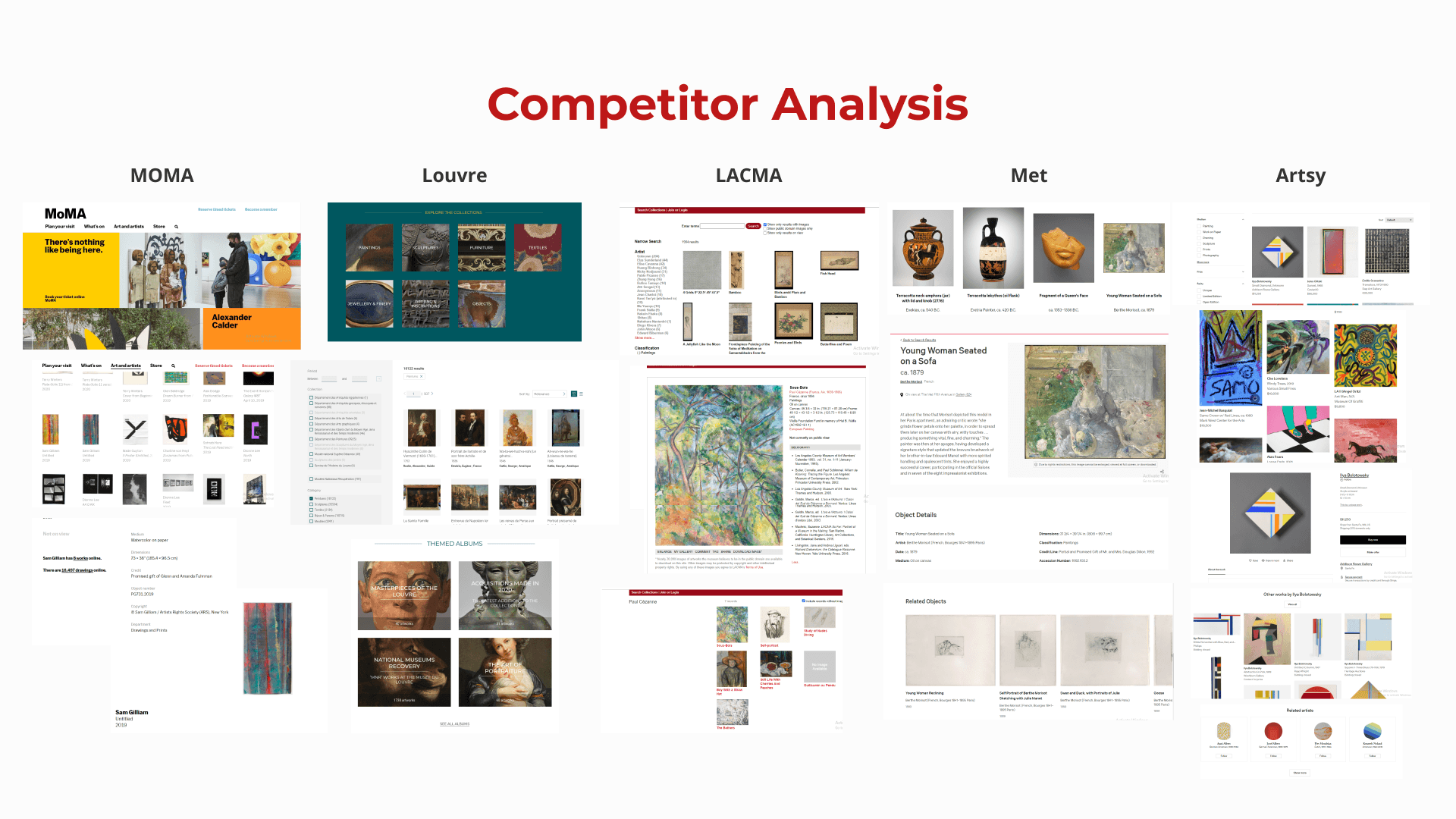
Understanding the current art market.
Understanding the current art market.
Understanding the current art market.
The stakeholders wanted the platform to look more like an art gallery than a library or archive, so I looked for references on how to best highlight the art, artists, and stories being told. I noted down the type of features and designs that were commonly used, how art pieces were organized, and overall was able to get a better idea of what the art industry was like. My findings gave me a good starting point for ideating potential features to include to make the product stand out from existing platforms.
The stakeholders wanted the platform to look more like an art gallery than a library or archive, so I looked for references on how to best highlight the art, artists, and stories being told. I noted down the type of features and designs that were commonly used, how art pieces were organized, and overall was able to get a better idea of what the art industry was like. My findings gave me a good starting point for ideating potential features to include to make the product stand out from existing platforms.
The stakeholders wanted the platform to look more like an art gallery than a library or archive, so I looked for references on how to best highlight the art, artists, and stories being told. I noted down the type of features and designs that were commonly used, how art pieces were organized, and overall was able to get a better idea of what the art industry was like. My findings gave me a good starting point for ideating potential features to include to make the product stand out from existing platforms.
To gain a better understanding about the pain points of the existing site and avoid assumptions and biases, my team and I conducted 9 user interviews and usability tests for the existing web platform. I chose to focus our questions on the main features/pages of the site (branding/aesthetics on the landing page, the featured item page, the featured collection page, browsing the archive, the map feature, and the submission form).
To gain a better understanding about the pain points of the existing site and avoid assumptions and biases, my team and I conducted 9 user interviews and usability tests for the existing web platform. I chose to focus our questions on the main features/pages of the site (branding/aesthetics on the landing page, the featured item page, the featured collection page, browsing the archive, the map feature, and the submission form).
To gain a better understanding about the pain points of the existing site and avoid assumptions and biases, my team and I conducted 9 user interviews and usability tests for the existing web platform. I chose to focus our questions on the main features/pages of the site (branding/aesthetics on the landing page, the featured item page, the featured collection page, browsing the archive, the map feature, and the submission form).
Understanding the common user experience on the existing Amplification Project platform.
Understanding the common user experience on the existing Amplification Project platform.
Understanding the common user experience on the existing Amplification Project platform.
My user research findings were:
My user research findings were:
My user research findings were:
9/9 users had issues with the displayed content
9/9 users had issues with the displayed content
9/9 users had issues with the displayed content
8/9 users found the current layout hindered their experience on the site
8/9 users found the current layout hindered their experience on the site
8/9 users found the current layout hindered their experience on the site
8/9 users faced usability issues with the map feature and thought the map was not very useful when browsing the archive
8/9 users faced usability issues with the map feature and thought the map was not very useful when browsing the archive
8/9 users faced usability issues with the map feature and thought the map was not very useful when browsing the archive
7/9 users wanted more information from the content
7/9 users wanted more information from the content
7/9 users wanted more information from the content
6/9 users emphasized how branding and aesthetic influenced their user experience
6/9 users emphasized how branding and aesthetic influenced their user experience
6/9 users emphasized how branding and aesthetic influenced their user experience
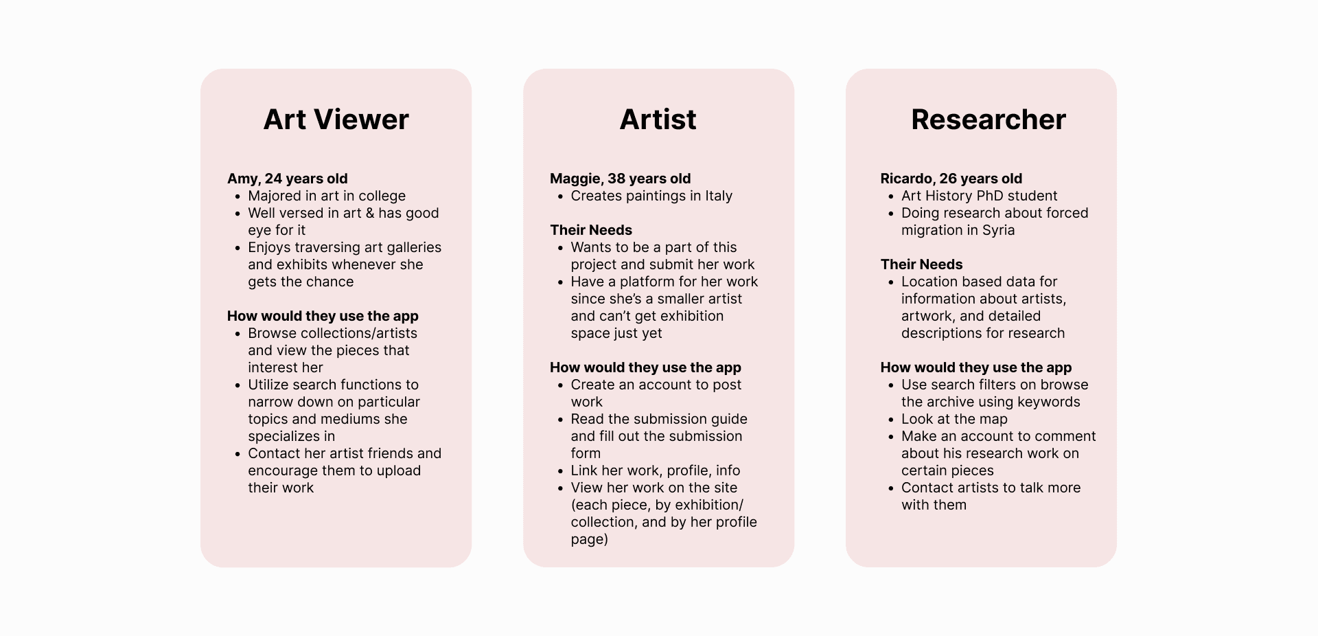
I wrote out a few user personas to separate user pain points based on use case.
I wrote out a few user personas to separate user pain points based on use case.
I wrote out a few user personas to separate user pain points based on use case.
With user research done, I compared stakeholder and user wants to plan how I can balance both pain points.
With user research done, I compared stakeholder and user wants to plan how I can balance both pain points.
With user research done, I compared stakeholder and user wants to plan how I can balance both pain points.
💼 Stakeholder
💼 Stakeholder
💼 Stakeholder
1
1
1
Create an image centric, art gallery-like experience across the platform
Create an image centric, art gallery-like experience across the platform
Create an image centric, art gallery-like experience across the platform
2
2
2
Include features that highlight the artists, art related news and events, and organization announcements
Include features that highlight the artists, art related news and events, and organization announcements
Include features that highlight the artists, art related news and events, and organization announcements
3
3
3
Design for greater accessibility
Design for greater accessibility
Design for greater accessibility
4
4
4
Improve the brand identity and visual design for a more welcoming feel
Improve the brand identity and visual design for a more welcoming feel
Improve the brand identity and visual design for a more welcoming feel
5
5
5
The logo, map feature, submission guide is kept in the updated design
The logo, map feature, submission guide is kept in the updated design
The logo, map feature, submission guide is kept in the updated design
6
6
6
Design with the organization's future plans in mind
Design with the organization's future plans in mind
Design with the organization's future plans in mind
👤 Users
👤 Users
👤 Users
1
1
1
Improve content formatting and labeling to easily navigate through and digest information
Improve content formatting and labeling to easily navigate through and digest information
Improve content formatting and labeling to easily navigate through and digest information
2
2
2
Include more detailed information about each art piece, collection, and the artist themselves
Include more detailed information about each art piece, collection, and the artist themselves
Include more detailed information about each art piece, collection, and the artist themselves
3
3
3
An easy and intuitive way to search through art works and artists
An easy and intuitive way to search through art works and artists
An easy and intuitive way to search through art works and artists
4
4
4
Enhance usability across all core features on the platform
Enhance usability across all core features on the platform
Enhance usability across all core features on the platform
I summarized my research in 3 key findings.
I summarized my research in 3 key findings.
I summarized my research in 3 key findings.
Key Findings:
Key Findings:
Key Findings:
1
1
1
A lack of consistency in artwork submissions caused user confusion
A lack of consistency in artwork submissions caused user confusion
Vague section headers and inconsistent labels and tags not only resulted in an unorganized information structure, but also caused confusion among users on what certain terms meant. The varied wording made it difficult to understand the context behind the works as well as search for them in the archive.
Vague section headers and inconsistent labels and tags not only resulted in an unorganized information structure, but also caused confusion among users on what certain terms meant. The varied wording made it difficult to understand the context behind the works as well as search for them in the archive.
2
2
2
Effective content layout enhances the clarity of information hierarchy
Effective content layout enhances the clarity of information hierarchy
Long wordy sections, seemingly never ending scrolling, inadequate spacing, etc. all lead to an ineffective information hierarchy, making users less likely to engage with the content. Users feel overwhelmed and are not able to digest the presented information.
Long wordy sections, seemingly never ending scrolling, inadequate spacing, etc. all lead to an ineffective information hierarchy, making users less likely to engage with the content. Users feel overwhelmed and are not able to digest the presented information.
3
3
3
Usability and accessibility help to an inclusive and engaging user experience
Usability and accessibility help to an inclusive and engaging user experience
Features should be designed to be intuitive and user-friendly, enabling effective utilization. Supporting accessibility initiatives, such as ensuring adequate color contrast and adjustable text size, allows everyone to fully enjoy the platform.
Features should be designed to be intuitive and user-friendly, enabling effective utilization. Supporting accessibility initiatives, such as ensuring adequate color contrast and adjustable text size, allows everyone to fully enjoy the platform.
With my research findings, I rewrote the problem statement into a "how might we" statement as well as listed out the overall design focuses for these projects. These serve as a high level guide that I can come back to and reference during the design process to check whether or not my solution is answering the problem at hand.
With my research findings, I rewrote the problem statement into a "how might we" statement as well as listed out the overall design focuses for these projects. These serve as a high level guide that I can come back to and reference during the design process to check whether or not my solution is answering the problem at hand.
With my research findings, I rewrote the problem statement into a "how might we" statement as well as listed out the overall design focuses for these projects. These serve as a high level guide that I can come back to and reference during the design process to check whether or not my solution is answering the problem at hand.
💭 How Might We
💭 How Might We
💭 How Might We
Design a site that archives the submitted art works and information in a effective and efficient manner for users and artists to connect through while emphasizing the art and activism displayed?
Design a site that archives the submitted art works and information in a effective and efficient manner for users and artists to connect through while emphasizing the art and activism displayed?
Design a site that archives the submitted art works and information in a effective and efficient manner for users and artists to connect through while emphasizing the art and activism displayed?
🔍 Design Focuses:
🔍 Design Focuses:
🔍 Design Focuses:
1
1
1
Standardization Data Entry
Standardization Data Entry
Standardization Data Entry
2
2
2
Content Organization System
Content Organization System
3
3
3
Friendly And Welcoming Branding/Aesthetic
Friendly And Welcoming Branding/Aesthetic
Design
Design
Design
Iterating based on stakeholder and team feedback
Iterating based on stakeholder and team feedback
Iterating based on stakeholder and team feedback
My team and I listed out some feature options that could be solutions to the overarching problem. I down selected those options, then mapped out end to end user flows. I then worked on low fidelity wireframes before moving to high fidelity prototypes. I would iterate on my designs based on feedback from my other team members as well as stakeholders to ensure my solution was meeting both business and user requirements.
My team and I listed out some feature options that could be solutions to the overarching problem. I down selected those options, then mapped out end to end user flows. I then worked on low fidelity wireframes before moving to high fidelity prototypes. I would iterate on my designs based on feedback from my other team members as well as stakeholders to ensure my solution was meeting both business and user requirements.
My team and I listed out some feature options that could be solutions to the overarching problem. I down selected those options, then mapped out end to end user flows. I then worked on low fidelity wireframes before moving to high fidelity prototypes. I would iterate on my designs based on feedback from my other team members as well as stakeholders to ensure my solution was meeting both business and user requirements.
After ideating a few solutions and narrowing down the options with the rest of my team, I created and presented low to mid-fidelity designs to stakeholders who gave my team feedback on what to improve. An overall key focus was to make sure the designs put the art first and foremost as well as balance standardized information with creative expression in art submission.
After ideating a few solutions and narrowing down the options with the rest of my team, I created and presented low to mid-fidelity designs to stakeholders who gave my team feedback on what to improve. An overall key focus was to make sure the designs put the art first and foremost as well as balance standardized information with creative expression in art submission.
After ideating a few solutions and narrowing down the options with the rest of my team, I created and presented low to mid-fidelity designs to stakeholders who gave my team feedback on what to improve. An overall key focus was to make sure the designs put the art first and foremost as well as balance standardized information with creative expression in art submission.

I prioritized designing the platform's core features for the MVP and worked quickly for the engineering team to start getting involved in developing the product. Some of the chosen solutions included:
I prioritized designing the platform's core features for the MVP and worked quickly for the engineering team to start getting involved in developing the product. Some of the chosen solutions included:
I prioritized designing the platform's core features for the MVP and worked quickly for the engineering team to start getting involved in developing the product. Some of the chosen solutions included:
1
1
1
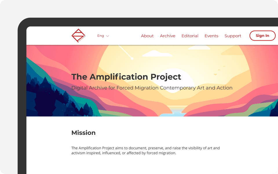
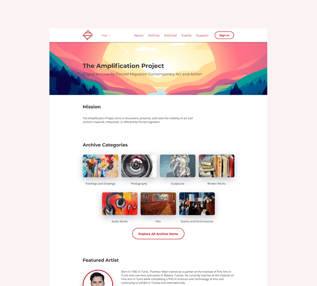
A welcoming and informative home page
A welcoming and informative home page
A welcoming and informative home page
The homepage showcases key offerings of the platform, featuring browsable preset artwork categories, featured artists, events, and editorials. The vibrant light mode and colorful imagery create an inviting atmosphere that enhances the user experience for everyone.
The homepage showcases key offerings of the platform, featuring browsable preset artwork categories, featured artists, events, and editorials. The vibrant light mode and colorful imagery create an inviting atmosphere that enhances the user experience for everyone.
The homepage showcases key offerings of the platform, featuring browsable preset artwork categories, featured artists, events, and editorials. The vibrant light mode and colorful imagery create an inviting atmosphere that enhances the user experience for everyone.
2
2
2
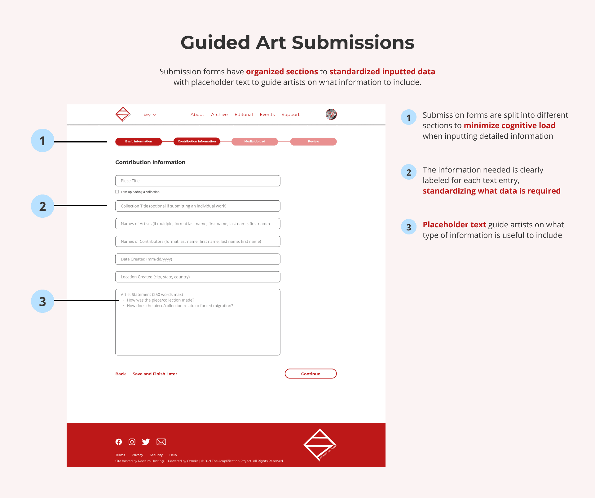
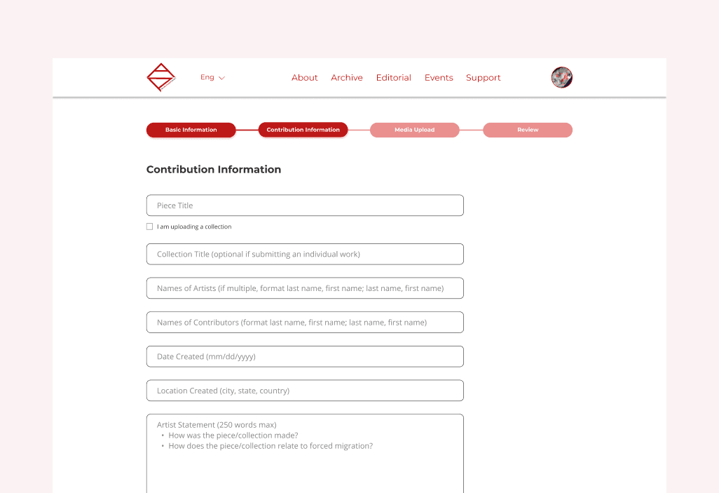
Standardized information entry
Standardized information entry
Standardized information entry
The submission form has clear labels and placeholder text to guide artists on what data is required for each art submission. Once submitted, art works are now better organized within the platform's system.
The submission form has clear labels and placeholder text to guide artists on what data is required for each art submission. Once submitted, art works are now better organized within the platform's system.
The submission form has clear labels and placeholder text to guide artists on what data is required for each art submission. Once submitted, art works are now better organized within the platform's system.
3
3
3
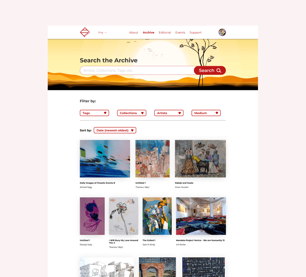
Browsing the platform
Browsing the platform
Browsing the platform
Users can look up art works and artists as well as filter and sort through their search results to find exactly what they need. The image centered design adds to the art gallery-like feel of the platform.
Users can look up art works and artists as well as filter and sort through their search results to find exactly what they need. The image centered design adds to the art gallery-like feel of the platform.
Users can look up art works and artists as well as filter and sort through their search results to find exactly what they need. The image centered design adds to the art gallery-like feel of the platform.
4
4
4
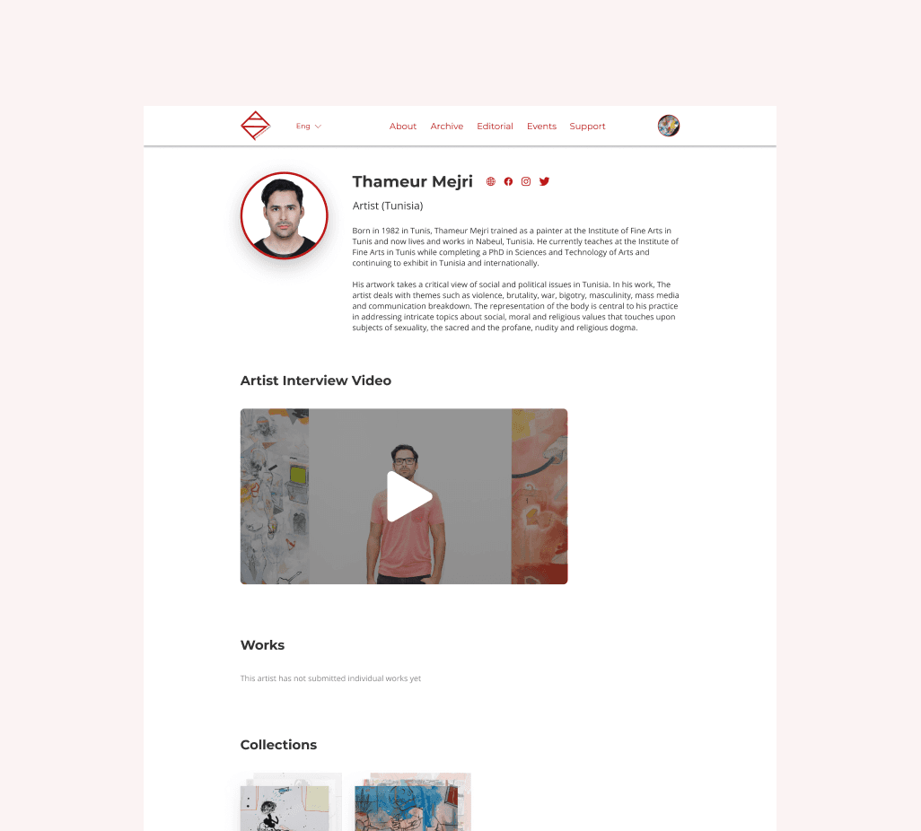
Putting a face to the art works
Putting a face to the art works
Putting a face to the art works
Artists have a profile page where they can provide more information about themselves, the causes they stand for, and organize their art submissions. This gives the art a more personal touch as users can connect with the artists behind them.
Artists have a profile page where they can provide more information about themselves, the causes they stand for, and organize their art submissions. This gives the art a more personal touch as users can connect with the artists behind them.
Artists have a profile page where they can provide more information about themselves, the causes they stand for, and organize their art submissions. This gives the art a more personal touch as users can connect with the artists behind them.

5
5
5
Categorizing each art piece
Categorizing each art piece
Categorizing each art piece
Users can read about the background and details of each individual art piece and art collection. The information is organized for users to easily view at a glance which also helps with the platform's information structure.
Users can read about the background and details of each individual art piece and art collection. The information is organized for users to easily view at a glance which also helps with the platform's information structure.
Users can read about the background and details of each individual art piece and art collection. The information is organized for users to easily view at a glance which also helps with the platform's information structure.
6
6
6
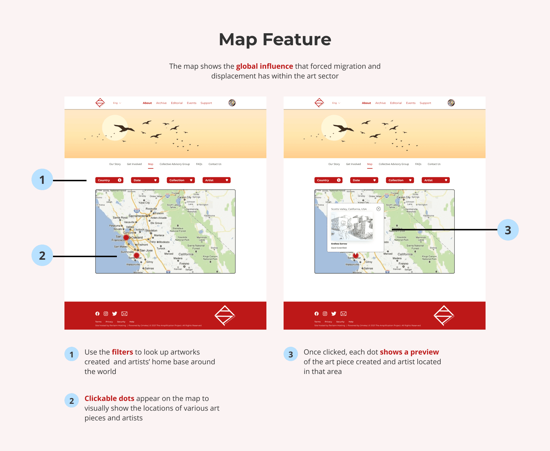
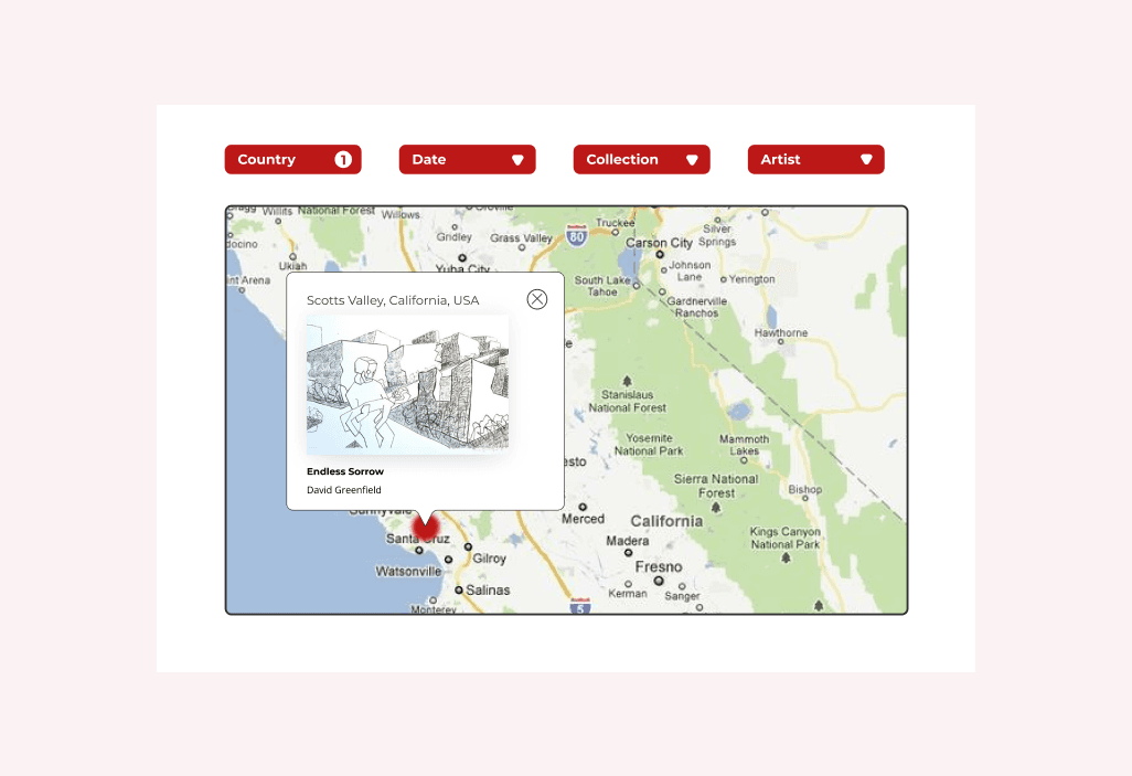
Viewing worldwide impact
Viewing worldwide impact
Viewing worldwide impact
This map feature allows users to view art and artists in relation to forced migration and displacement happening around the world. As a result, they can gain a better understanding of the global impact of the Amplification Project's mission.
This map feature allows users to view art and artists in relation to forced migration and displacement happening around the world. As a result, they can gain a better understanding of the global impact of the Amplification Project's mission.
This map feature allows users to view art and artists in relation to forced migration and displacement happening around the world. As a result, they can gain a better understanding of the global impact of the Amplification Project's mission.
Once the designs were finalized, my team and I met with stakeholders to walk through the MVP design end to end, breaking down the solution and explaining features along the way.
Once the designs were finalized, my team and I met with stakeholders to walk through the MVP design end to end, breaking down the solution and explaining features along the way.
Once the designs were finalized, my team and I met with stakeholders to walk through the MVP design end to end, breaking down the solution and explaining features along the way.
Conclusion
Conclusion
Conclusion
Impact
Impact
Impact
Enhancing user interaction rates by 30%
Enhancing user interaction rates by 30%
With an updated information structure and content layout and formatting, users are able to digest information more easily without overload. As a result they are able to engage more deeply with the content presented.
With an updated information structure and content layout and formatting, users are able to digest information more easily without overload. As a result they are able to engage more deeply with the content presented.
User satisfaction on the platform's overall experience rose 25%
User satisfaction on the platform's overall experience rose 25%
The platform’s core features now offer improved usability, allowing users to navigate easily and interact intuitively. This enhancement leads to a more engaging and immersive art experience.
The platform’s core features now offer improved usability, allowing users to navigate easily and interact intuitively. This enhancement leads to a more engaging and immersive art experience.
User engagement increased by 40%
User engagement increased by 40%
Compared to before, an improved branding and identity has strengthened the Amplification Project's usability and accessibility. Consequently, a wider range of users can access the platform seamlessly and engage with its content effectively.
Compared to before, an improved branding and identity has strengthened the Amplification Project's usability and accessibility. Consequently, a wider range of users can access the platform seamlessly and engage with its content effectively.
Next Steps
Next Steps
Next Steps
Longer term user research and usability testing
Longer term user research and usability testing
Although the solutions were designed to improve the platform's overall user experience, further testing should be done, ideally another round with our existing group of 9 users. This would help me see how effectively the changes addressed their needs and identify any additional areas for refinement.
Although the solutions were designed to improve the platform's overall user experience, further testing should be done, ideally another round with our existing group of 9 users. This would help me see how effectively the changes addressed their needs and identify any additional areas for refinement.
Continue to improve the platform's accessibility
Continue to improve the platform's accessibility
There is more to accessibility than color contrast and text size. I would want to continue the efforts to improve the Amplification Project's accessibility by ensuring the platform has proper keyboard navigation, each image has descriptive alt text, can render in various languages and more.
There is more to accessibility than color contrast and text size. I would want to continue the efforts to improve the Amplification Project's accessibility by ensuring the platform has proper keyboard navigation, each image has descriptive alt text, can render in various languages and more.
Prepare for the organization's future plans
Prepare for the organization's future plans
Given our limited timeframe, my team was unable to fully integrate the organization’s future plans into our design. For the next iteration, it’s essential to proactively incorporate these strategic goals to ensure the platform evolves effectively and meets long-term objectives.
Given our limited timeframe, my team was unable to fully integrate the organization’s future plans into our design. For the next iteration, it’s essential to proactively incorporate these strategic goals to ensure the platform evolves effectively and meets long-term objectives.
Connect with me!
I love making new friends and getting to know people. Feel free to reach out to me if you have any questions or just want to chat!
Made with love and care by Crystal Huynh © 2024
Connect with me!
I love making new friends and getting to know people. Feel free to reach out to me if you have any questions or just want to chat!
Made with love and care by Crystal Huynh © 2024
Connect with me!
I love making new friends and getting to know people. Feel free to reach out to me if you have any questions or just want to chat!
Made with love and care by Crystal Huynh © 2024
Connect with me!
I love making new friends and getting to know people. Feel free to reach out to me if you have any questions or just want to chat!
Made with love and care by Crystal Huynh © 2024